
Trulia Rebrand
Online real estate has significantly evolved since Trulia launched in 2005. It was time for us to not just stand out in a crowded sea of sameness, but to also change. We learned from our customers that neighborhoods are just as important, if not more, than the home itself. We launched a new brand mission: build a more neighborly world by helping you discover a place you’ll love to live.
Our creative team led a company-wide effort to deliver on our new mission with our rebrand below. The new mission guided our creative strategy, our words, visuals, product, and everything in between.
This rebrand helped drive increased user acquisition (especially for customers interested in exploring neighborhoods) and renewed loyalty for the Trulia brand as a knowledgeable industry leader.
Our new logo embodies the idea that when diverse elements fit together in unexpected ways you create a sense of harmony and balance.

With help from DesignStudio, we created an icon system as the foundation of our brand, which is composed of three categories: dwellings, landscape & weather, and places & amenities, illustrating all aspects of neighborhoods. These icons can be used functionally (in our app as a descriptor), on their own, or clustered together to represent more complex concepts like neighborhoods.
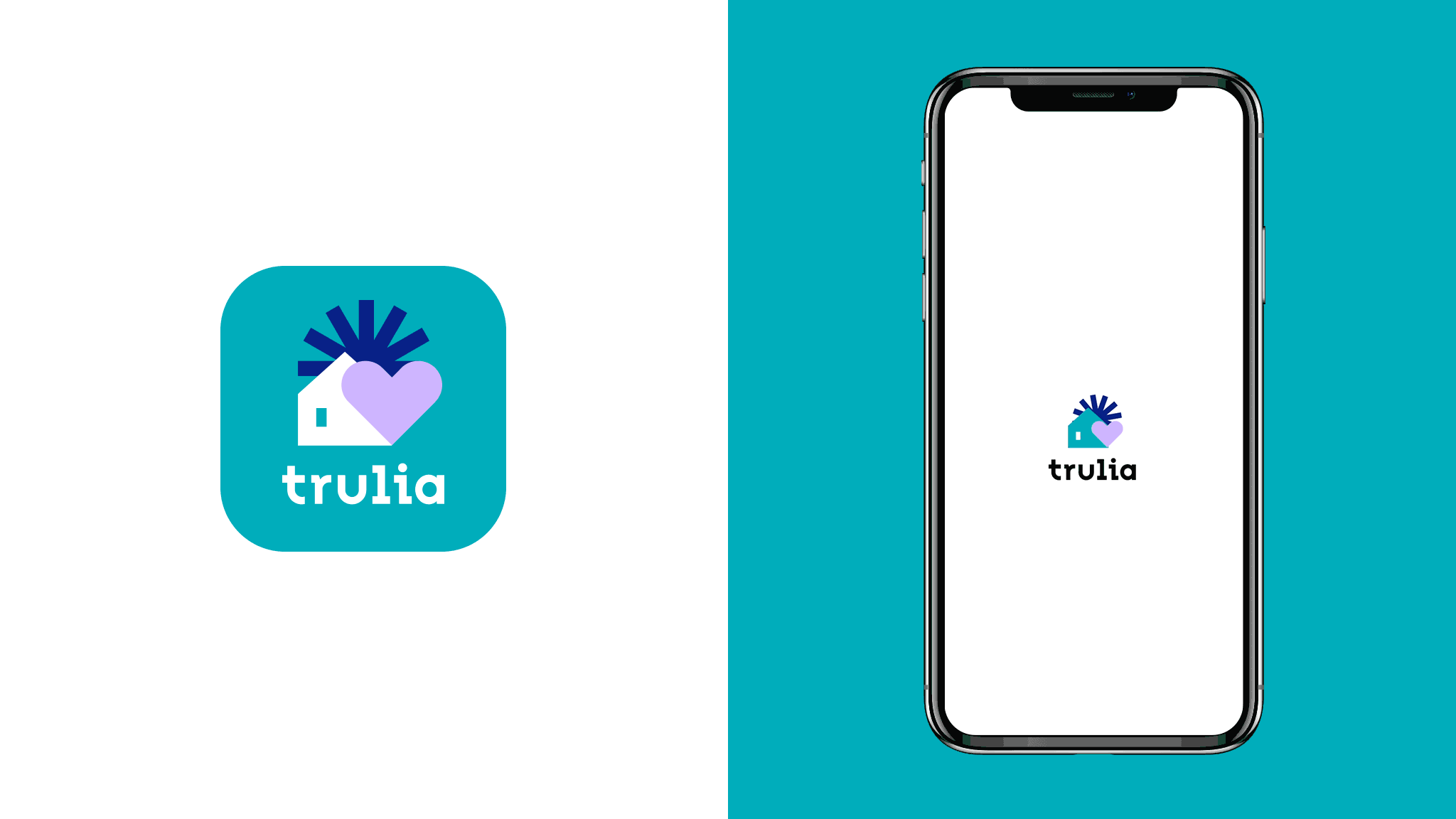
After exhaustive user testing our rebrand app icon options with varying icons and compositions, we had a clear winner that our users loved and stood out from other homebuying apps: a house to signify homebuying, a heart to signify love, and a sun to create a sense of environment. When users open the app for the first time, the new app splash screen now only shows off our grid of icons, it also creates a common thread with the new app icon.

Our brand colors were strategically derived from different parts of neighborhoods from all across the country. These included the greens from parks and lawns, blues from skies and lakes, warm tones from the local flower shops or tile roofs, and neutrals from urban areas. And of course, we gave them neighborhood names to reinforce the neighborhood concept internally.

We worked with FontSmith to create a custom typeface called Trulia Sans to make sure our brand comes across as open and approachable.

We captured photography from neighborhoods all across the country. We developed not just a guideline, but a visual strategy to help our photographers capture the neighborhoods from the eyes of a local, giving a glimpse of what it would be like to actually live there.

The Trulia product incorporates the color palette, typography, and functional iconography.


Credits
Creative Director: Jessica Staley
Agency Partner: DesignStudio
Creative Copy Lead: Alex Solarte
Animator: Salih Abdul-Karim